Je vous préviens, cette astuce n'est pas facile du tout à réaliser.
PREMIERE ETAPE :
Allez chez PROTOTIP
Cliquez sur 1.6

Vous arrivez sur Prototype.js, vous allez y trouver ce lien
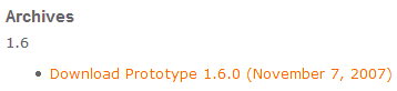
Cliquez dessus : une page s'ouvre.
Copiez le contenu de cette page.
Ouvrez votre blog-note.
Collez ce contenu
Sauvegardez le fichier sous prototype.js
DEUXIEME ETAPE :
Cliquez sur Download pour télécharger le fichier
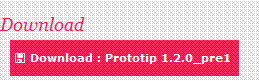
Il s'agit d'un fichier .zip : un ensemble de fichiers compressés. Pour le décompresser, j'utilise WinRAR, la fonction Extraire Vers
TROISIEME ETAPE :
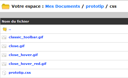
Dans l'administration de votre blog, allez dans Documents - Mes Fichiers :
- Vous créez un répertoire Prototip
- dans ce répertoire, vous créez 2 sous-répertoires :
- js
- css
- dans le sous-répertoire js, vous enregistrez les fichiers suivants :
- prototip.js
- prototype.js (celui de la première étape)
- prototip.js
- dans le sous-répertoire css, vous enregistrez les fichiers suivants :
- classic_toolbar.gif
- close.gif
- close_hover.gif
- close_hover_red.gif
- Vous notez les URL de ces 4 images.
QUATRIEME ETAPE:
Sur votre PC, vous ouvrez le Bloc-Notes, puis le fichier prototip.css
Vous modifiez les adresses des images suivantes avec les adresses des images que vous venez d'enregistrer dans votre administration (lors de la troisième étape) :
- .prototip .toolbar a.close {position: relative; text-decoration: none; float: right;width: 15px; height: 15px; background: transparent url(close.gif);display: block; line-height: 0; font-size: 0px; border: 0; }
- .prototip .toolbar a.close:hover { background: transparent url(close_hover.gif); }
- .prototip .darktip .toolbar a.close { background: url(close_hover.gif);}
- .prototip .darktip .toolbar a.close:hover { background: url(close.gif);}
- .prototip .silver .toolbar a.close:hover { background: url(close_hover_red.gif);}
- .protoClassic .toolbar { background: #96b8e2 url(classic_toolbar.gif) top left repeat-y; font-weight: bold; color: #fff;}
- .protoClassic .toolbar a.close:hover { background: url(close_hover_red.gif);}
Vous enregistrez le fichier sous le même nom prototip.css
CINQUIEME ETAPE :
Dans l'administration de votre blog, vous allez dans Mes Documents - Autres Fichiers - Répertoire Prototip - Sous-Répertoire css et vous enregistrez ce document : prototip.css;
Vous avez donc :
Vous notez les adresses de tous ces fichiers
SIXIEME ETAPE :
Lors de la rédaction d'un article, en HTML, vous collez :
<link href="http://ddata.over-blog.com/xxxyyy/0/37/17/67/prototip/css/prototip.css" type="text/css" rel="stylesheet" />
<script src='http://ddata.over-blog.com/xxxyyy/0/37/17/67/prototip/js/prototype.js' type='text/javascript'>
</script><script type='text/javascript' src='http://ddata.over-blog.com/xxxyyy/0/37/17/67/prototip/js/prototip.js'>
Avec vos propres adresses de fichiers
SEPTIEME ETAPE :
Selon l'infobulle voulue, vous allez rajoutez toujours en HTML :
<div id="tip1">Exemple 1</div>
Vous noterez la concordance tip1 <---> box1
<script type="text/javascript" language="javascript">
new Tip('tip1', 'Simple tooltip');
new Tip('box1', "hook: { target: 'topLeft', tip: 'bottomRight'}", {title: 'hooking', className: 'pinktip', hook:{target: 'topLeft', tip: 'bottomRight'},
offset: {x:0,y:0} });</script>
Ce qui donne (survolez avec la souris) :
Exemple 1
POUR LES AUTRES INFOBULLES :
Vous pourrez avoir besoin du fichier scriptaculous.
Pour les installer :
1) vous recopiez toujours le pavé de la sixième étape,
2) vous personnalisez le pavé de la septième étape : en remplaçant<div id="tip1">Exemple 1</div> par l'id qui vous plait (vous voyez les différentes infobulles dans la démo)
<div id='tip2'>2 : Add a title</div>
puis en remplaçant (en respectant les numéros)
<div id='tip3'>3 : Add offset</div>
<div id='tip4'>4 : Fixed positioning</div>
<div id='tip5'>5 : A different target</div>
<div id='tip6'>6 : Hooking!</div>
<div id='tip7'>7 : HTML</div
<div id='tip8'>8 : Effects!</div>
<div id='tip9'>9 : More effects</div>
<div id='tip10'>10 : Update</div> « <a href='javascript:;' onclick='updateExampleTip("pinktip", "Usefull when you want to update your tooltips with
Ajax");'>1</a> | <a href='javascript:;' onclick='updateExampleTip("darktip", "Or if you just want to give them a new style.");'>2</a> | <a href='javascript:;'
onclick='updateExampleTip("default", "Just call newTip() again on the element to update it’s tooltip");'>3</a>
<div id='tip11'>11 : Delay (500ms)</div>
<div id='tip12'>12 : Click me!</div>
<div id='tip13'>13 : Links</div>
<div id='tip14'>14 : Toggle (click)</div>
<div id='tip15'>15 : Style with CSS</div>
<div id='tip16'>16 : Element as tooltip</div>
<div id='tip17'>17 : Auto hide</div>
<div id='tip18'>18 : Stay within the viewport</div>
new Tip('tip1', 'Simple tooltip');
par
new Tip('tip2', 'Sed ut perspiciatis unde omnis iste natus error sit voluptatem accusantium doloremque laudantium, totam rem aperiam, eaque ipsa quae ab illo inventore veritatis et quasi
architecto beatae vitae dicta sunt explicabo. Nemo enim ipsam voluptatem quia voluptas sit aspernatur aut odit aut fugit, sed quia consequuntur magni dolores eos qui ratione voluptatem sequi
nesciunt.', {title : 'Lorem Ipsum'});
new Tip('tip3', 'offset {x:60,y:-100}', {title: 'Tooltip with offset', className: 'darktip', offset: {x:60, y:-100}});
new Tip('tip4', 'Fixed tooltip', { fixed: true, offset: { x: 0, y:18 } });
new Tip('tip5', 'Instead of putting the tooltip on the element you are hovering, you can target a different element.', { className: 'darktip', title: 'This tooltip has
"11" as target.', target: 'tip11', offset: {x:0,y:0}});
new Tip('tip6', 'This tooltip hooks to the top right corner of this element.<br/> You can do a lot more with hooking, read below.', { className: 'pinktip', title:
'hooking', hook: {tip: 'bottomLeft', target: 'topRight'}});
new Tip('tip7', 'You can use html within a tooltip. <br/><strong>Go </strong><span style="text-decoration:
line-through;">crazy</span><br/><br/><img src="images/demo_flower.gif" alt=""/>', {title: 'HTML', className: 'darktip'});
new Tip('tip8', 'This tooltip uses "appear"', { className: 'pinktip', title: 'Show your tooltips with Scriptaculous effects!', effect: 'appear', hook:
{target: 'topRight', tip: 'bottomLeft'}});
new Tip('tip9', 'This tooltip uses the "blind" effect.', { title: 'more effects', className: 'darktip', effect: 'blind', hook: {target: 'topRight', tip:
'bottomLeft'}});
new Tip('tip10', 'Click any of the links on the right, 1, 2, 3 to update this tooltip.', {title : 'Update existing tooltips'});
new Tip('tip11', 'This tooltip opens with a 500ms delay.<br/><br/>By default all tooltips open with a short delay, so you can mouseover your page safely without
opening up tooltips right away.', {title : 'Delay', className: 'darktip', delay: 0.5});
new Tip('tip12', 'You have complete control over the way you open and <a href="javascript:;" class="close">close</a> tooltips.', {title : 'More control', className:
'pinktip', showOn: 'click', hideOn: {element: '.close', event: 'click'}, closeButton: true});
new Tip('tip13', Projects.getTipContent('starbox'), { className: 'ideaTip', effect: 'blind', hook: { tip: 'bottomLeft', target: 'topRight' }, hideOn: false, hideAfter: 1.5,
offset: { x: 5, y: 5 }});
new Tip('tip14', 'This tooltip will hide itself when you click the link again.', {title : 'Toggle tooltips', className: 'pinktip', showOn: 'click', hideOn: 'click',
closeButton: true});
new Tip('tip15', 'Everything you need to customize your tooltips can be done through CSS. Even the close buttons can be styled with a mouseover state.', {title : 'Style your
tooltips', className: 'protoClassic', showOn: 'mousemove', hideOn: {element: 'closeButton', event: 'click' }});var supportClone = $('donate').cloneNode(true);
supportClone.insert({ top: '<p>Instead of using a string for the content, you can insert an element created through to DOM. The content inserted into this tooltip is a
clone of the support message.<strong/><p/>' });
new Tip('tip16', supportClone, { title : 'Element as tooltip', hideOn: { element: 'tip', event: 'mouseout'}, hideAfter: 1.5, effect: 'appear', hook: { tip: 'topLeft', target:
'bottomLeft'}, offset: { x: 0, y: 5 }, className: 'pinktip'});
new Tip('tip17', 'This tooltip will automatically hide after a two seconds of inactivity. That means, when you are not on the tooltip itself or on the element that opened the
tooltip.', { title : 'Auto hide', hideOn: false, hideAfter: 2, hook: { tip: 'topRight', target: 'topLeft'}, offset: { x: -5, y: 0 }});
new Tip('tip18', '<p>By default, all tooltips will stay within the viewport. When you resize your browser window you can notice it on this
tooltip.</p><p>Tooltips that use hooking or have a fixed position will not stay within the viewport. Prototip assumes that you know what you want when you use those
options.</p>', { title : 'Stay within the viewport', className: 'darktip' });
puis en remplaçant l'encadrement (tous n'en ont pas et toujours en respectant le numéro)
new Tip('box1', "hook: { target: 'topLeft', tip: 'bottomRight'}", {title: 'hooking', className: 'pinktip', hook:{target: 'topLeft', tip: 'bottomRight'},
offset: {x:0,y:0} });
par
new Tip('box1', "hook: { target: 'topLeft', tip: 'bottomRight'}", {title: 'hooking', className: 'pinktip', hook:{target: 'topLeft', tip: 'bottomRight'}, offset: {x:0,y:0} });
new Tip('box2', "hook: {target: 'topLeft', tip: 'bottomRight'},<br/> offset{x:0, y-10}", {title: 'hooking with offset', className: 'pinktip', hook:{target: 'topLeft',
tip: 'bottomRight'}, offset: {x:0,y:-10} });
new Tip('box3', "hook: {target: 'topRight', tip: 'bottomLeft'}", {title: 'hooking', className: 'pinktip', hook: {target: 'topRight', tip: 'bottomLeft'}, offset: {x:0,y:0}
});
new Tip('box4', "hook: {target: 'topLeft', tip: 'topRight'}, <br/>offset: {x: -5, y: 0}", {title: 'hooking with x-offset',className: 'pinktip', hook:{target:
'topLeft', tip: 'topRight'}, offset: {x:-5,y:0} });
new Tip('box5', "target: 'box1', <br/>hook: {target: 'topLeft', tip 'bottomRight'}", {title: 'target box1 instead', className: 'pinktip', target: 'box1', hook:{target:
'topLeft', tip: 'bottomRight'}, offset: {x:0,y:0} });
new Tip('box6', "hook: {target: 'topRight', tip: 'topLeft'}, <br/>offset: {x: 5px, y: 0}", {title: 'hooking with x-offset', className: 'pinktip', hook:{target:
'topRight', tip: 'topLeft'}, offset: {x:5,y:0}, viewport: true });
new Tip('box7', "hook: {target: 'bottomLeft', tip: 'topRight'}", {title: 'hooking', className: 'pinktip', hook:{target: 'bottomLeft', tip: 'topRight'}, offset: {x:0,y:0}
});
new Tip('box8', "hook: {target: 'bottomLeft', tip: 'topLeft'},<br/> offset: {x: 0, y: 5}", {title: 'hooking with y-offset', className: 'pinktip', hook:{target:
'bottomLeft', tip: 'topLeft'}, offset: {x:0,y:5} });
new Tip('box9', "hook: {target: 'bottomRight', tip: 'topLeft'},<br/> offset: {x: 5, y: 5}", {title: 'hooking with x and y-offset', className: 'pinktip', hook:{target:
'bottomRight', tip: 'topLeft'}, offset: {x:5,y:5} }); - classic_toolbar.gif
Aucun commentaire:
Enregistrer un commentaire
1/ Choisissez Nom/URL comme profil pour poster, si vous hésitez
2/ Si vous désirez une aide personnalisée, pensez à laisser l'adresse de votre blog, ce qui me permettra de tester.
3/ Vous pouvez vous abonner par email pour suivre les réponses de cet article (lien sous la zone de rédaction du commentaire)